What font is the Honda logo?
Honda is among the 3 top car manufacturers in Japan, alongside Mazda and Toyota. They create great cars, but they also shine in the scientific area. They invest a lot into technology and science – for instance, the famous ASIMO robot is with us thanks to them.
Meaning and History
However, if you look at their logo, you can’t really see the technology. It’s a standard text that was created some time after the company launched, and it remained the same for the past 70 years. Regardless, they compensate this lack with the other symbols of their design.
1955 – 2000
Even though the company started business in 1948, they only came up with the logo years after the first day. Their design was the red company name, written in a fairly usual font, all letters were capital.
What font is the Honda logo?
It’s Honda’s custom logotype. It’s a bold and thick serif with linear notches all around it. It is noticeably squashed from the top, making it look stretched out. It was never really changed, except for one minor decision in 2000.
2000 – now
In 2000, Honda did one small change in their logo. All the strict and blocky parts became rounded and smooth. It’s really not a big deal at all – you won’t notice it until you look into the two versions very hard. But the bosses deemed it very necessary. And well, it does look better, if you notice it.
Symbol and Emblem
Different car manufacturers come up with the unique badges for their cars. In case with Honda, this symbol has even more meaning.
What is the Honda symbol?
The Honda’s specific automobile subsidiary has its own iconic badge they put in the front of the cars, as well as on their direct property.
The colors and the composition differ, but since the 1981 it’s always been an H-symbol, encircled in a sort of rounded rectangle. This symbol is noticeably thin, and the upper lines are much longer than the lower ones.
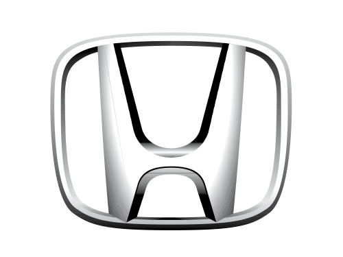
The usual colors are either silver with nothing between the symbol and the frame, or silver with the deep red in-between. They also have different logos for their other subsidiaries, most notably the motorcycle emblem.
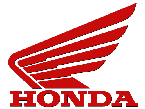
Honda motorcycle emblem
The Honda’s primary motorcycle manufacturer is called HMSI. As other daughter companies, their official logo is pretty much just a Honda logo with some details. Here, the additional detail is the red wing on top of the company name.